Charts
Live charts over your tables — every chart type, axes, series options, combos, trend lines, secondary axes, and image export.
Charts are live views over table columns: change the data and the chart follows. Create one with Insert → Chart or, faster, Create chart from table… in a table's menu.
Charts always plot the whole table — even very large tables where the grid shows a preview window, a chart reads every row.
DreamSheets charts follow a grammar-of-graphics model: you pick a mark (bar, line, …) and map columns onto channels (X, Y, color, size). That one model covers everything from a quick bar chart to a dual-axis combo.
Chart types
| Type | For |
|---|---|
| Bar | Comparisons across categories; stacked or grouped |
| Line | Trends over an ordered axis |
| Area | Trends with magnitude; stackable |
| Pie | Share of a whole (labels + values) |
| Scatter (point) | Two numeric variables; supports size and shape channels |
| Histogram | Distribution of one numeric column |
| Density | Smoothed distribution |
| Violin | Distribution per category |
| Map | Values by country or US state (choropleth), or latitude/longitude points |
Combining rows by category
A table usually has many rows per category — thousands of sales rows across four regions. Charts combine them into one mark per category, so a bar is the region's total rather than thousands of stacked slivers.
- Sum is the default for bar, pie, and map charts. Change it with Combine rows by category in the chart editor: Sum, Average, Count of rows, Minimum, Maximum.
- Line, area, and scatter charts don't combine by default — a repeated X value there is usually a real second series or a genuine scatter cloud. You can still switch them to a reducer.
- Don't combine (one mark per row) turns it off entirely for bar, line, and area charts — useful when your table already has exactly one row per category.
- The caption under each chart says which reading you're looking at: "Sum of Amount by Region · 4 categories · 12,000 rows".
Tooltips, data labels, and the value sort order all follow the combined values, so what you hover matches what you see.
Channels
- X and Y — the primary encoding. Y accepts multiple series (+ Add series…).
- Color — split series by a category column.
- Size and Shape — scatter charts only.
A channel normally points at a column of the chart's home table, but any channel can reference a column from another table, and can be sliced to a row range with the range picker — chart just this quarter's rows without touching the data.
Axes
Each axis (X, Y, and the secondary Y) has: a title, a number format (defaults to the plotted column's display format), min / max bounds, tick interval, and label rotation (presets from horizontal to ±90°). Gridlines and axis values can be toggled per chart.
Scales can be linear, log, or square-root, and the X axis can be forced categorical or continuous (the default auto-detects). Category order is controllable: table order, label A→Z / Z→A, or by value ascending/descending — the last two make sorted bar charts trivial.
Multiple series, combos, and the secondary axis
Each Y series has its own options:
- Mark type — override a series to render as bar, line, or area, making combo charts (bars for revenue, a line for margin).
- Axis — assign a series to the right-hand secondary Y axis. The secondary axis activates when at least one series is on each side, and has its own format and bounds. Essential when one series is in dollars and the other is a percentage.
- Trend line — a linear regression per series (needs a continuous numeric X axis with no bar series). For the fitted coefficients, diagnostics and p-values behind such a line, see statistical tests.
- Data labels — per series, or chart-wide.
Multi-series bar and area charts can be stacked, grouped, or overlaid. Histograms and density plots can normalize to % of total.
Appearance
- Palettes: Tableau 10, Category 10, Observable 10, Set 2, Paired, Blues, Viridis. (Document-level series colors are themeable via View → Colors….)
- Themes: Default, Minimal, Black & white, Classic.
- Legend: top / right / bottom / left / hidden — switchable right on the chart card.
- Font family and base size per chart.
Dashboards
Insert → Dashboard… composes a dashboard from charts and tiles you already have: pick them, and DreamSheets builds a new tab with a titled section frame, your charts placed inside as live references (the same chart — edit it anywhere, it updates everywhere), and suggested filter tiles for category columns your tables share (one Region card can drive every table with a Region column).
Right-click the section's title → ▶ Present to show it full-screen: the frame letterboxes to your window, the app chrome disappears, and the dashboard stays live — viewers can pick filter tile values, type bounds, and click bars to cross-filter, but nothing they do edits the document. Esc exits.
Small multiples
Split into panels (in the chart editor, for bar/line/area/scatter) draws one panel per distinct value of a category column — four regions become four small charts sharing the same axes, which beats squeezing them into one plot when the question is "how do these compare?". Each panel aggregates its own rows. Grouped-bar mode and the secondary Y axis don't combine with panels (both already spend the layout the panels need).
Filter tiles
There are two ways to filter. Filter in place (right-click a column header) hides rows in that one grid and reaches nothing else — see tables. A filter tile is a dashboard control on the canvas that filters views: the charts and table cards in its reach. Right-click a column header → Add filter tile, or right-click a section frame → Add filter tile to pick from the columns of the tables inside it.
The tile shows its name and one line describing what it currently filters to — is one of East, West, > 100, is after 2026-01-05, or (All). Click that line to change it: you get the same picker the in-place filter uses, with the operators for the column's type — a checklist of values with a search box, is empty / is not empty, numeric comparisons, contains / starts with / ends with for text, and is on / before / after / between with a date picker for dates. Apply, and the charts and table cards it reaches re-scope; Clear filter or untick the card to restore everything.
A filter tile's reach is its scope. A tile created from a section (or by Create Dashboard) is scoped to that section: it drives exactly the cards inside the frame — a table card inside it shows only the matching rows, a chart inside re-aggregates, and the same chart placed outside the section keeps showing everything; other tabs are never affected. A tile created from a column header scopes by a table list instead (every card reading those tables; edit the list in the panel). Right-click the card → Scope to switch between the two.
- Choosing a value is not an edit. It doesn't dirty the file, land in undo, or sync to collaborators — each viewer explores freely. Save current value as default (right-click the card) stores a starting value in the document.
- Click a bar to filter. On a bar chart whose X column has a filter tile, clicking a bar sets the tile to that category; clicking it again clears it; Ctrl+click adds or removes a category. The chart you clicked keeps showing every bar so you can keep clicking — only the other views narrow.
- Highlight mode keeps every mark and dims the ones that don't match — often better than filtering, because you keep the context you're comparing against.
- Click the card to edit it — the right-side panel holds the definition: name, column, whether the value is picked on the tile or comes from a custom formula, mode, and which tables it applies to (any table with a same-named column). The panel's Change value… opens the same picker.
- Custom formulas: choose Custom formula… under Compare and write a row predicate like
=@Amount > 100 AND @Region = "West"— rows where it's TRUE pass. (Formulas evaluate over the rows loaded in the session — the first 10,000 of a very large table.) - Require a selection makes downstream views empty until the viewer picks — for dashboards that shouldn't show a meaningless all-up total.
- Filter tiles never change data: a query table or a formula reading a filtered table still sees every row. To make a query respond to a filter, write the condition into its SQL.
- Filter tiles show lineage arrows from their source table, like every other card.
Maps
A Map chart plots a table geographically, entirely offline — boundaries are bundled, and no data leaves the app.
- Filled regions (choropleth) — point the Region channel at a column of country or state names and the Value channel at a number; regions fill on a color ramp. Labels match flexibly: full names, ISO codes (
US,DEU,GBR), USPS state codes (CA,TX), and common variants (UK,Ivory Coast,Czech Republic) all resolve. Rows naming the same region sum. - Latitude/longitude points — one dot per row, with optional Size and Color channels, over a world or US basemap.
- Two map areas: World (countries) and United States (states, with Alaska/Hawaii insets).
- Labels that don't match any region are listed under the map ("2 unmatched: …") rather than silently dropped — fix the spelling or switch to a code.
Street-level maps and address geocoding are out of scope: region names and coordinates cover the spreadsheet cases, and both work with no network access.
The chart editor
The right-dock chart editor is organized into collapsible sections — data, axes, series, appearance — and its channel labels adapt to the chart type (Slices / Values for pie, Variable for histogram). Every change renders live, and every change is one undo step.
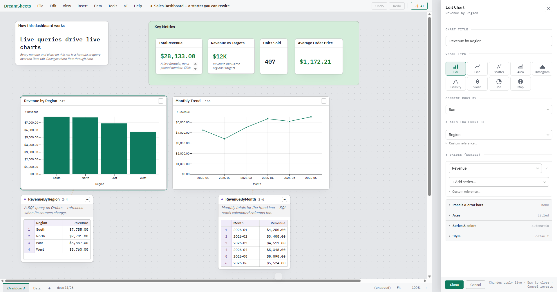
- Source — a dropdown that sets which table the chart reads. Changing it keeps every channel whose column name also exists in the new table and clears the rest; one Undo restores the old source.
- Ctrl+click a column (its header or any cell in it) on the canvas while the chart editor is open to add it to the active channel — the one you last clicked into, Y by default. On Y it's added as another series.
- A column from a different table than the chart's source gets a question first: columns from separate tables can get out of sync if one of them is sorted or filtered. Choose Combine tables to open the Combine tables form prefilled with that table and the columns the chart uses (when you create it, the chart switches to the combined table), Add anyway, or Cancel.
Getting charts out
- Copy image / Save image… in the chart menu produce a PNG of the plot — for pasting into a doc or chat. The image is the plot area itself; the HTML legend and caption aren't included.
- Export to XLSX turns each chart into a native, live Excel chart whose series reference the exported cells — recipients get a real chart, not a screenshot. (Histogram, density, violin, and map have no Excel equivalent; the export notes them rather than failing. A chart that combines rows by category also carries a note, because an Excel chart plots the exported rows directly.)
- Charts also import from Excel, reconnecting series to the imported tables.